Teyvat PaletteTeyvat colour cards
Scene library
GitHub
Gallery
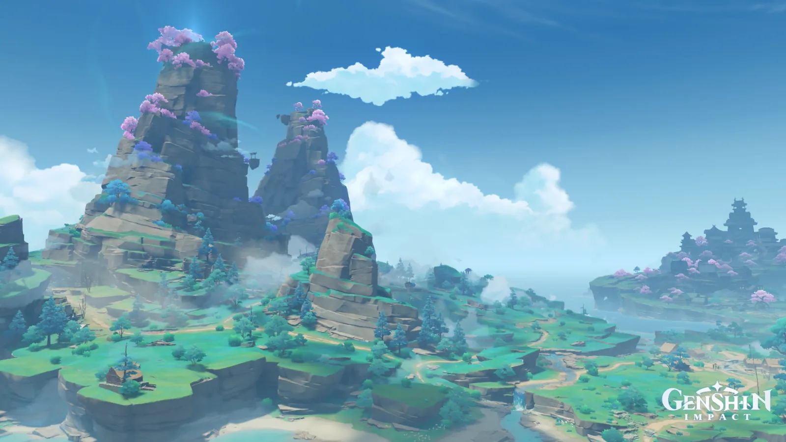
Narukami Island in Clear Haze
InazumaDayCrystallineOpenDrifting Haze

Narukami Island in Clear Haze

Palette

Click a swatch to copy its HEX; hover for the OKLCH value.

Reconstructed gradient

The gradient distilled from the scene, unrolled left to right by stop; the authored angle is 180° (used by the hero and exports), while gallery cards share a uniform 135° sweep.

0%377db414%9591c532%e7f9fe56%4a708f78%50c2a4100%57a69a

Why it works

Warmth need not be a rank on the wheel; a difference in chroma alone will do. The picture has not one qualifying pixel between 330° and 45°, and where the three things read as gold in Elton Trench at least held the seat nearest the warm end at 145°, the cliffs read as sandstone here measure 244° — the same hue as the sky overhead (245°), only 0.04 apart in lightness, with nothing but chroma between them, 0.065 against 0.110. In a cold field pure enough you do not even need the seat nearest the warm end: take four-tenths of the chroma out of one plane and the eye will read it warm for you.

01

The sandstone is a 244° blue

Three samples of the rock face, restricted to blue-band pixels so the blossom crowns stay out: L 0.53 / chroma 0.065 / 244°, L 0.53 / 0.055 / 240°, and even the mid-ground face that catches the most light once the sun clears the left peak from the upper left is only L 0.61 / 0.046 / 234°. The sky overhead is L 0.57 / 0.110 / 245°. Same hue, 0.04 apart in lightness, six-tenths of the sky's chroma — crop the two peaks out on their own and they are slate blue; put them back and they are sun-baked sandstone. Nostoi Region recorded the same illusion once, in fog (a patch that looked like red roof tiles measured L 0.78 / 0.086 / 237°), but there the difference was lightness; here lightness barely moves and the split is entirely chroma. To paint warm rock, you do not need warm paint: take four-tenths of its chroma out of the field first.

02

The real warm colour is the one you never saw

Search the whole frame from 330° to 45° and not a single pixel reaches the grey threshold. Everything from 15° to 90° adds up to 270 pixels, 115 of them crowded onto one wooden hut on the lower-left terrace, averaging L 0.71 / chroma 0.035 / 80° — the only place in the picture that actually dipped into warm paint is a house the size of a palm. Salacia Plain likewise had barely a hundred warm pixels (106), yet there they were the one bright thing anybody sees; the difference is strength — 0.084 chroma at 44° there against 0.035 at 80° here, weak enough to be eaten by the grass beneath it. So warmth comes fully unhooked from warm colour: a real warm that is not vivid may as well not exist, while a warmth made of no warm colour holds up fine, provided it is large enough and low enough in chroma.

03

Make the sky the most saturated plane first

The trick needs a field that is both pure and vivid: the blue band takes 78.44% and the cyan band 11.75%, nine-tenths of the pixels packed into the 105° between 165° and 270°. And of the 4000 most saturated pixels, 3511 land between 240° and 270°, at (0.42, 0.13) — the most vivid thing in the picture is the sky, not any subject in it. The eye takes the strongest colour on screen as its reference and pushes every plane below that reference towards the opposite side; that is why the cliffs turn warm. How thick the cold field is decides how far from the warm end a candidate may sit: Elton Trench's blue ground holds 54.58% (its own figure, quoted), enough to crown a 145° yellow-green as gold — but those three things were still sitting in the seat nearest the warm end. Here the cold field runs to ninety-odd per cent, thick enough to push even 244°, a hue from the sky's own family, across. To copy this, check first that your ground colour is the most saturated plane you have. If it isn't, taking chroma away only gets you grey.

Take these colours with you

CSS variables, a Tailwind v4 theme or SVG — one click to copy into your project.

/* Narukami Island in Clear Haze · Narukami Island in Clear Haze — Teyvat Palette */
:root {
  --zenith-blue: oklch(0.57 0.11 245); /* Zenith Blue #377db4 */
  --sandstone-blue: oklch(0.53 0.065 244); /* Sandstone Blue #4a708f */
  --cumulus-white: oklch(0.97 0.02 219); /* Cumulus White #e7f9fe */
  --young-grass: oklch(0.67 0.08 183); /* Young Grass #57a69a */
  --pine-teal: oklch(0.74 0.113 173); /* Pine Teal #50c2a4 */
  --sakura-violet: oklch(0.68 0.076 288); /* Sakura Violet #9591c5 */
  --gradient-narukami-island: linear-gradient(180deg, oklch(0.57 0.11 245) 0%, oklch(0.68 0.076 288) 14%, oklch(0.97 0.02 219) 32%, oklch(0.53 0.065 244) 56%, oklch(0.74 0.113 173) 78%, oklch(0.67 0.08 183) 100%);
}

A 1080×1350 PNG carrying the scene, its palette and every value — save it and post it as is.