Teyvat PaletteTeyvat colour cards
Scene library
GitHub
Gallery
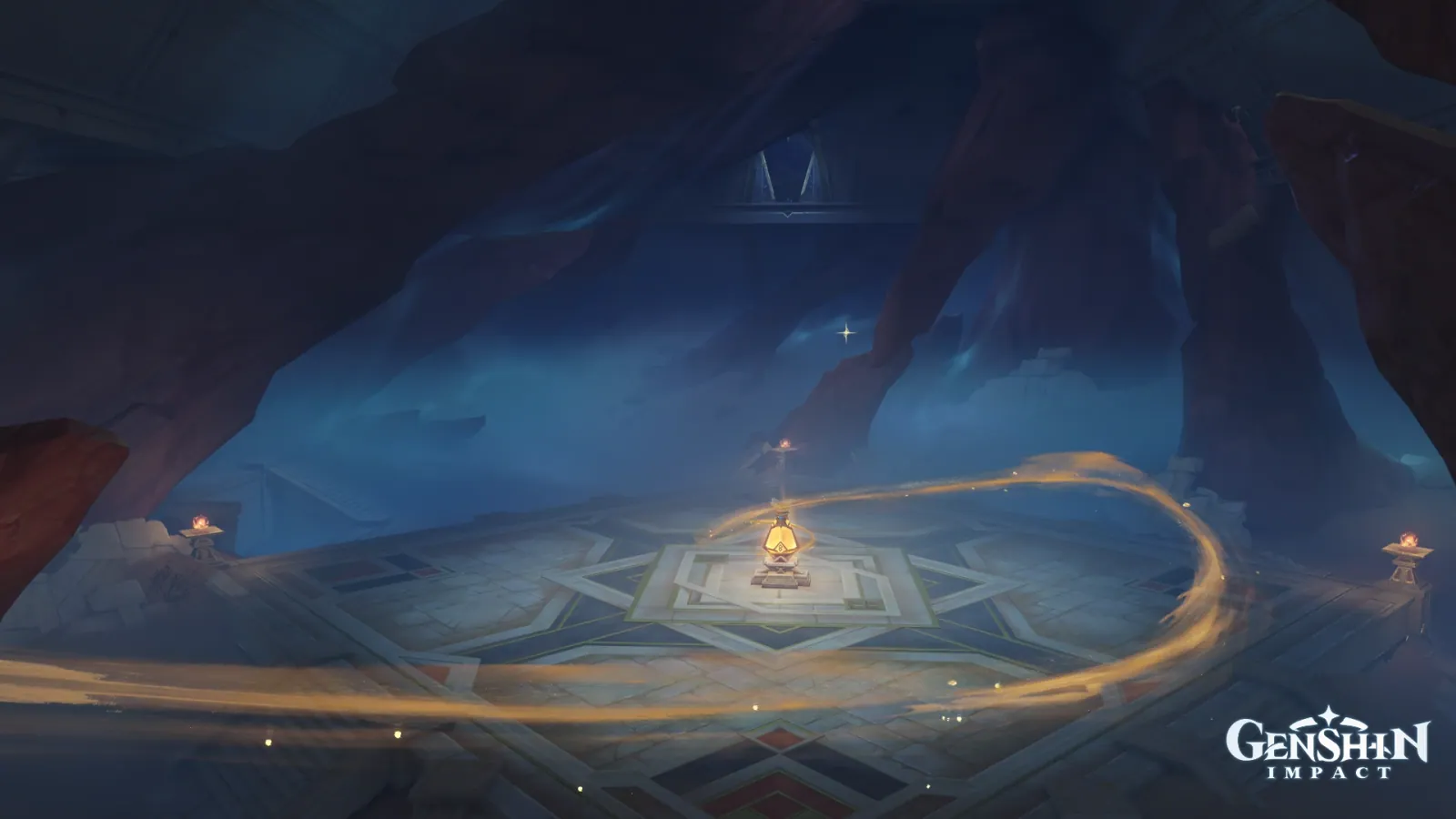
Bayt Al-Muazzam under Two Lights
SumeruSolemnCavernousWaiting

Bayt Al-Muazzam under Two Lights

Palette

Click a swatch to copy its HEX; hover for the OKLCH value.

Reconstructed gradient

The gradient distilled from the scene, unrolled left to right by stop; the authored angle is 180° (used by the hero and exports), while gallery cards share a uniform 135° sweep.

0%171c2d38%27416263%fbd77878%637578100%997d64

Why it works

Two lights of opposite colour temperature in one hall are not competing, they are dividing the work — and the division is booked separately, one in area and one in lightness. The cold blue covers 53.00% of the frame at mean lightness 0.35 and its job is to hold the cave open as a room; the warm gold covers 3.72% at mean lightness 0.58 and its job is to say where to look. The two families stand 168° apart and neither takes anything from the other: this frame's chroma allowance (p99 0.081 minus the median 0.035) is only 0.046, barely above the 0.038 of Bayt Al-Hayah, which has no chroma to spend at all — yet its focus is far harder. What buys a hard focus is hue distance, not chroma allowance.

01

Cold light charges by area, warm light charges by lightness

The blue band (210°–270°) covers 53.00% at mean L 0.35 / chroma 0.049 / hue 258°. The gold band (45°–90°) covers 3.72% at mean L 0.58 / chroma 0.051 / hue 66°. A factor of 14 in area, 0.23 apart in lightness, and almost identical in chroma — neither light spends a coin on the other's ledger. Gold wants brightness: the lamp's core measures L 0.89 / chroma 0.121, the ribbon sweeping around to the right L 0.61 / hue 64°, the small brazier flame on the left L 0.77 / hue 53°, and not one of them ever spreads past 4%. Blue wants area: it runs from the rock overhead (L 0.23) to the haze in the middle distance (L 0.37) and never brightens anywhere. Light has two jobs in a picture — holding volume, and pointing at the focus — and the resources they need are exactly complementary. When you put two colour temperatures in one interface, settle the division of labour first: the one with the area is not allowed to be bright, the bright one is not allowed to be big. Ask for both and they cancel each other.

02

3.72% of gold is as certain as 2.81% of flower

Bayt Al-Sukr in the same set gives its focus to two self-lit flowers: 2.81% of the frame, rectangle chroma 0.144, pushing the whole picture's chroma allowance to 0.173. The gold here covers 3.72% at mean chroma 0.051, with a chroma allowance of 0.046 — under three tenths of that — and the two focal points are equally unmistakable. The difference is on the hue ledger: over there the flowers' 322° is only 47° from the haze at 275°, the end of the same band; here the gold at 66° is 168° from the blue haze at 258°, nearly opposite. Paying in hue distance has a precondition, though: blue and violet together make 71.46% of this frame, and only because the large areas are already gathered into a narrow band does the gold have an "opposite" to stand in. To economise on chroma, buy hue distance instead — push the biggest surfaces into a narrow band first, then place the focus straight across from it.

03

The same 0.022 grey, one cancelled out and one conceded

The star-patterned stone floor at the centre measures L 0.55 / chroma 0.022 / hue 207°, below the achromatic threshold of 0.025, and it is the bulk of this frame's 23.22% achromatic area. The floor in «Adventurers' Guild Mondstadt at Lamplit Dusk» reads chroma 0.022 / 201° — two countries apart, two floors identical to three decimal places. Their origins are opposite, though. Mondstadt's grey is what warm lamplight and cold dusk produced by cancelling each other on one floor; this floor was laid by people and has no hue of its own, so the two lights write on it separately — the gold ribbon still measures L 0.55 / chroma 0.036 / hue 65° where it reaches the lower edge, and the blue haze over the same stone is still 255°. Neither is eaten by the other. If you want two colour temperatures to keep their identities on one surface, do not let them meet there: give that surface a material with no hue of its own and let it be a canvas, not a palette.

Take these colours with you

CSS variables, a Tailwind v4 theme or SVG — one click to copy into your project.

/* Bayt Al-Muazzam under Two Lights · Bayt Al-Muazzam under Two Lights — Teyvat Palette */
:root {
  --lampcore-gold: oklch(0.89 0.121 89); /* Lampcore Gold #fbd778 */
  --ribbon-gold: oklch(0.61 0.05 64); /* Ribbon Gold #997d64 */
  --vault-blue: oklch(0.37 0.066 255); /* Vault Blue #274162 */
  --star-pavement: oklch(0.55 0.022 207); /* Star Pavement #637578 */
  --dome-slate: oklch(0.23 0.034 272); /* Dome Slate #171c2d */
  --gradient-bayt-al-muazzam: linear-gradient(180deg, oklch(0.23 0.034 272) 0%, oklch(0.37 0.066 255) 38%, oklch(0.89 0.121 89) 63%, oklch(0.55 0.022 207) 78%, oklch(0.61 0.05 64) 100%);
}

A 1080×1350 PNG carrying the scene, its palette and every value — save it and post it as is.